Monday, June 15, 2015

Design Evaluation

Today, I'm evaluating two packaged water designs (I say packaged because one of them isn't bottled) these are both similar in price, and both seem to target earth and nature lovers. I'm always curious why we pick one bottle of water over the other. I find myself always reaching for that smart water over the arrowhead, even though they have no difference in taste and a world of difference in price.

While in California last fall, I noticed these two waters. I was drawn to one and annoyed by the other.


The Good:


This is boxed water, but you already knew that since the brand told you in its bold minimalist script. Since my discovery of this product last fall I've seen it all over the world of instagram, people can't get enough of it. I think it can be chalked up to its simple design. Its got clean lines, contrast and a simple statement "Boxed Water is Better".  In recent years, I think drink packaging has evolved into its own sort of fashion statement. Though I've never purchased this water, I easily picture its minimalist design going well with any outfit as a strut around campus.

 This design also targets the earth consciousness in all of us. The flip side of the box elaborates the statement "Boxed Water is Better for the Earth." It has a clean info graphic that elaborates the company mission. It has very simple pictures followed by a few sentences that explains the companies process. This graphic, like the other graphics is very simple and minimalistic.

The Bad:

This bottled water is actually pretty cool, after doing a bit of research I found out that it is from pure collected rain water in Tasmania, Australia. The water is bottled without ever touching the ground. It's pretty neat, and fairly expensive, but that's something you would never know by just looking at the label.


First off...What does that label say? It says "Tasmanian Rain", unfortunately you wouldn't know the name just by looking at the profile of the product. You need to physically pick it up and turn it a few degrees each way just to know the name of the water...or if it even is water? (it is water) I'm typically a fan of negative space, but this label takes it too far. I think they could better utilize the negative space on the bottled to actually name their product. The picture in the background is of trees reflected on a lake, its so tiny on the bottle, its hard to determine what the picture even is. The position of the silhouette of the trees seems to form some unnecessary line breaks within the design, making the name even harder to read. This particular design in its entirety was published in a magazine. Its hard to read, and the law of simplicity makes the reader question the image on the bottle, my brain immediately wants to assume its the same photo that's in the background, but its not. This confusion causes dissonance and as most of us know, a confused mind will always say "No."

Wednesday, June 10, 2015

Contrast, Balance and Harmony


Let me preface this by saying I usually hate multiple exposure, I usually find them ultra cheesy and terrible. I always, always, always flash back to my parents wedding photos in 1987. That being said, I like this one, though it was a tough choice to analyze it for class, I like it.

Contrast: We can easily spot the differences in color and texture between the empire state building, the whites of the buildings at ground level, and the city's street folk. Beyond that, I love how it juxtaposes the empire state building with the female form, it creates a new figure ground relationship that I appreciate. Often we associate skyscrapers with masculinity. However, this photo positions the female as the photo's co-subject.

Balance: The photo is visually pleasing because of its symmetrical nature with the subjects of the photo (The woman/Empire State Building) centered within the frame. The lines of the buildings all run perfectly horizontal and vertical creating pleasing lines in that regard.  Psychologically, this photo is balanced to me because it is giving representations to multiple sides of NYC, We see the iconic building, the ground view, the skyline, and figures of the residents of the city. If you've ever been, you know the city is as busy as the photo portrays, and to me this is giving a balanced representation of the experience.

Harmony: This photo achieves harmony through its repeatable rhythms in different elements of the exposures. The continuation of the skyline has a different rhythm than the passer byers. And the repeating patterns of Rockefeller Plaza certainly have a different rhythm than the woman. We are able to group together the different elements, there we are able to tell ourselves a story. Culturally, I feel this photo has harmony because of the woman standing still, to me she is at ease and a quiet observer in a bustling city.

Tuesday, June 9, 2015

Law of Similarity


Law of Similarity: Items that are similar are grouped together. In this graphic, we group together the white circles to reveal a film reel.


Here is a second example, mostly because I love coke and this resonates with me. We naturally group the coke bottles together to reveal a smile.

Wednesday, June 3, 2015

Viceral Response


This is the image I have chosen to analyze for my own visceral response when viewing a design. When I look at this image, I can't help but be drawn in, the lines pleasingly carry the eyes to the center of the image, and then back out, infinitely. I love the contrast created using the single key light from the window. This lighting tactic highlights the design which created contrast and aids in carrying the eye. This design did not happen by accident... 


This architectural design was created using the Fibonacci Sequence. This sequence occurs in nature, everything from pineapples to face shapes, bees nests to hurricanes. Many of us have heard of it, or at least as its sometimes referred as "The Golden Ratio" or "Rule of [almost] Thirds". In a Fibonacci Spiral, such as this, the center (if complete) would represent the area of 1 followed by 1:3:5:8:11 and so on. I'm no math person, so bear with me, each number in the sequence represents the sum of the previous two numbers. Here's a diagram.


Okay, cool Lacey, math...how does this apply to the design, or the you visceral response? It important because this ratio, and the golden spiral are found in EVERYTHING. We have observed it our whole lives in nature we don't even think about it. For instance, if we find another person attractive, its usually because their face closely resembles this sequence. We don't pull out the measuring tape and start measuring the width of the mouth compared to the distance of their pupils, we call them pretty, or handsome.
   
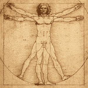
I understand that I have such a strong response to this image simply because it is a pattern I find pleasing, a pattern that I have been familiar with my whole life. This image captured my attention just like the human form captured Leonardo Da Vinci's in his illustration of the Vitruvian Man or Mona Lisa.


Well, there is your math, history, and design lesson folks. I am glad the image of the stair case caught my attention in such a way that I was able to analyze the reasoning behind my emotional response.